Out With the Old, In With the Colorful!

If you've driven down Washington Street recently…
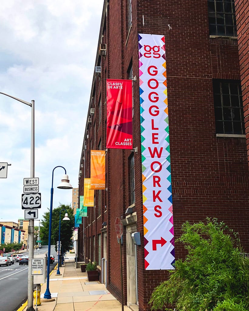
You may have noticed an extra pop of color on GoggleWorks’ building.
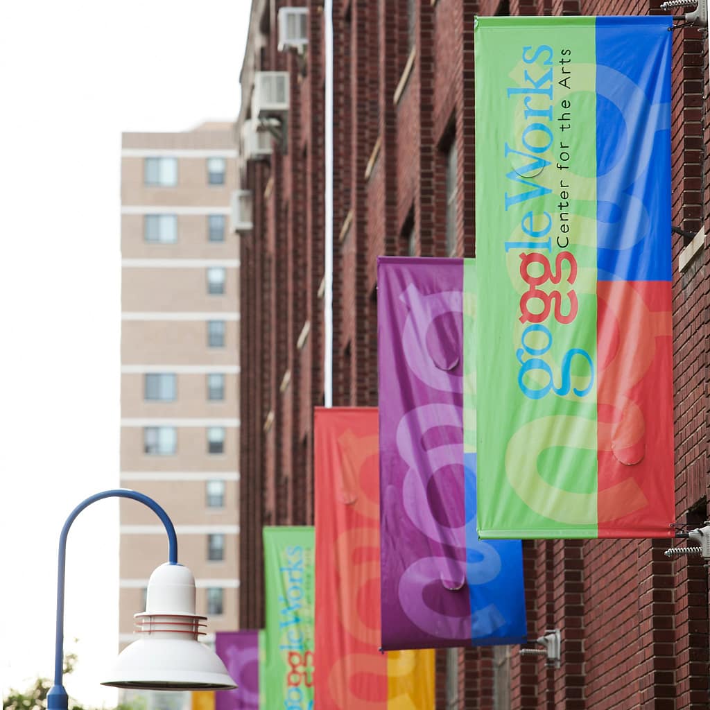
In the early months of 2019, several members of the staff began collaborating with the GoggleWorks’ studio artists by creating a committee they called “Task Force.” The goal of this Task Force was to enhance the partnership between GoggleWorks’ staff and its resident studio artists. Task Force launched into conversations with the artists and began creating projects based on the artists’ ideas and suggestions about the building. From those discussions came the proposal to replace the sun-faded banners, that once hung proudly on the Washington Street side of the building, with something more vibrant, eye-catching, and informative. As one of the most highly traveled streets in the city, Washington Street offers an opportunity to reach out to thousands of passersby each day.

Keeping the objective in mind to create more aesthetically pleasing banners that would be both more accessible to the community and more accurately represent GoggleWorks as an organization, Task Force got to work on design plans. Design at its core, is artistic problem-solving resulting in a functional finished product. This kind of problem-solving is exactly what GoggleWorks’ Marketing Director and primary graphic designer, Jess Santucci, signed up for. With only eight banners to work with, the challenge was to select wording that accurately described the entirety of GoggleWorks while also being brief enough that the information can be read quickly while people are driving. Jamie Smith, Director of Operations and head of the Task Force says that, “Determining the wording for the banners took a lot of discussion,” and that they considered the words “Creative Experiences” for one of the banners. Ultimately, they decided that although “creative experiences” was a fun and interesting description, for passersby who are unfamiliar with GoggleWorks, it would be too abstract of an idea to read and process in an instant. Paired with the fact that the words were also visually too long to use, Task Force opted for a more straightforward approach to the banner text, eventually landing on “Art Classes,” which is much more clear and concise.
Jess recounts brainstorming with Task Force in the beginning stages of the project, “Originally, we had attempted to utilize a mixture of icons, simple text, and our logo but quickly realized we were making the project much more complicated than it needed to be and decided to forgo the use of the icons.” In late 2019 and into early 2020, you may have noticed GoggleWorks’ rebranding efforts, during which the organization reinvented its official colors. Jess knew right away that she wanted to use those colors in this project, noting that, “An arts center should be fun, accessible and engaging, and I wanted the banners to reflect that through their design. I initially came up with four potential iterations, using our new purple as the test color to work through the different design options.”
1. Simple solid color
2. Hard-lined two-tone
3. A dripping effect, with the idea that it would evoke the idea of paint
4. The Winner

Jess walked us through the creative process that led her to the winning design: “The first three options were fine, but none of them really screamed “creative” or “fun” to me. Visually, they were safe and a little boring. Since using images and icons to add visual interest was no longer an option, I decided to play around with the purple base color. Using a color picker, I isolated three purple hues (a light, medium, and dark) that complimented the original purple and added them to the banners in the form of three triangles. The triangles create visual direction for viewers, while the repetition of shapes and tones across all eight banners is eye catching and easy to digest.”
After determining the base design with the Task Force, Jess says that the rest of the banners came together in no time. This process was as simple as picking the appropriate hues for the following banners, as well as making sure everything was uniform and correctly aligned. In the final editing stages, the only changes that needed to be made were a few tweaks to text size and placement of the Spanish and English text.


Jess, Jamie and the rest of the Task Force were over the moon with the way that the new banners turned out and couldn’t wait to see them installed. When asked about the final product, Jess expressed her satisfaction with the project, saying, “I think we knocked it out of the park and accomplished our goal. The banners are easy to spot, look great from a distance, and are easy to read.” Without the context of its arts and community focus, a large, industrial, former factory building like GoggleWorks can be intimidating to walk up to, but Jess believes that the new banners give the exterior a friendlier feel, and will encourage people to wander in and get an idea of what GoggleWorks is really about because, “Who doesn’t love a rainbow?!”

“From enjoying an art class, to visiting our studio artists, people can now, at-a-glance, be more informed of how they can engage with their local art center. We hope our new vibrant banners, featuring both English and Spanish, will grab the attention of our immediate community and visitors,” Jamie remarked about the final installation.
GoggleWorks is grateful for a Facade Improvement Grant received through private funding from the Berks Alliance, managed by the Greater Reading Chamber Alliance that allowed us to purchase new banners.
